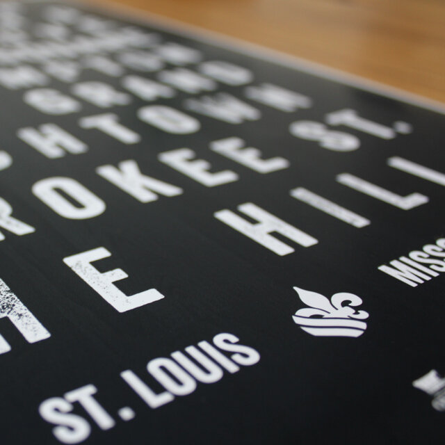
St Louis Fleur De Lis
As a designer that lives, loves and deals a lot in St Louis culture, I find it difficult to visually represent StLouis without using: the Arch, the Cardinals’ STL logo, the Blues’ note, or the Cardinals’ Bird. All of which are trademarked logos, of course. The St Louis city flag works, but can only be utilized in so many different ways before getting played out or too clunky. And more simply, using a simple run of the mill “fleur de lis” would be difficult as it represents anything French in and of itself.
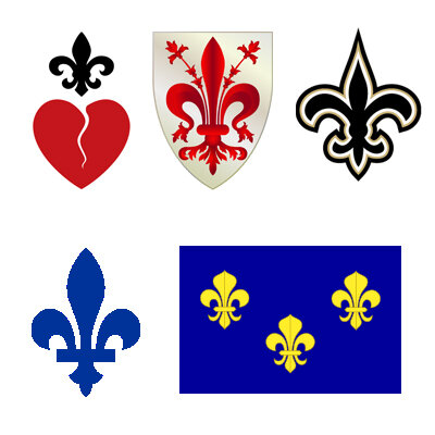
What I found is that the fleur de lis is heavily used in New Orleans, a very French influenced town much like St Louis. Actually, most of the Louisiana teams use the French symbol: LSU, the Pelicans, and The Saints. Not only that, but many other French influenced American cities and towns utilize the symbol as well, such as: Creve Coeur, Detroit, Lafayette, Louisville, Mobile, and Ocean Springs.
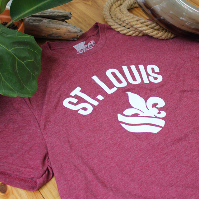
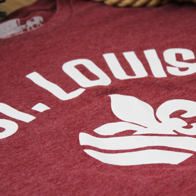
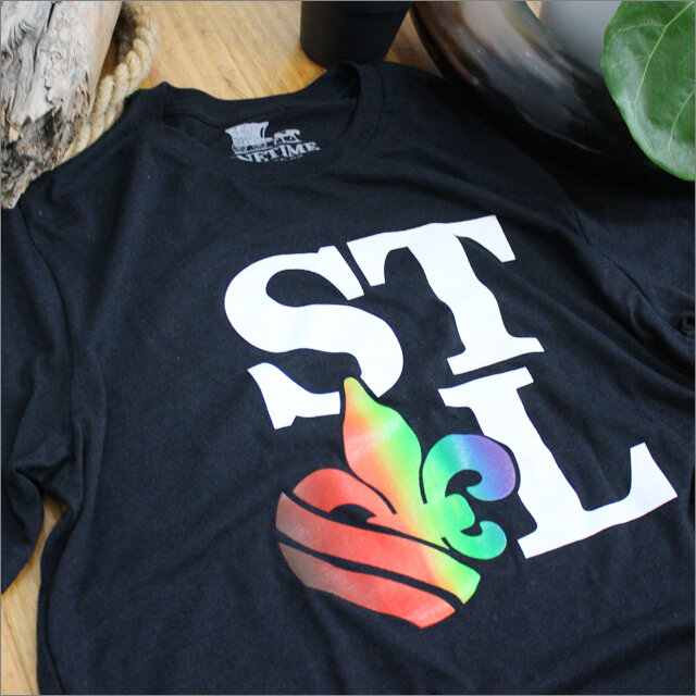
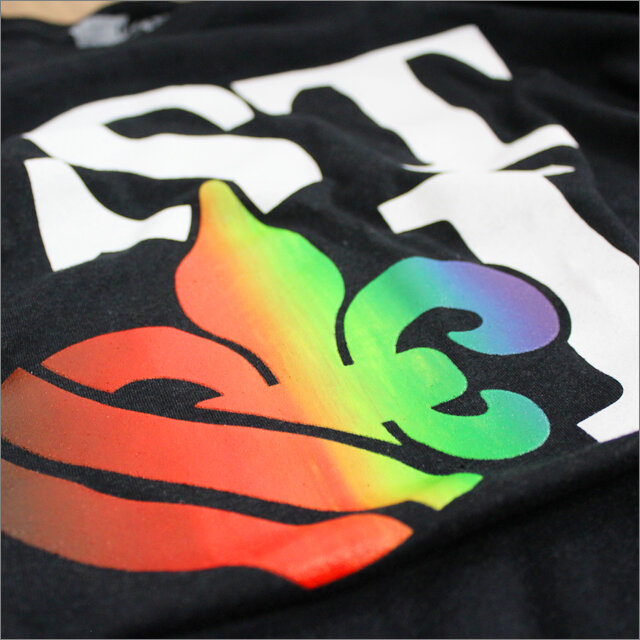
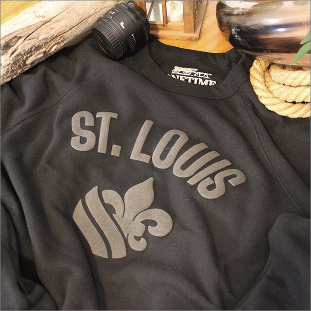
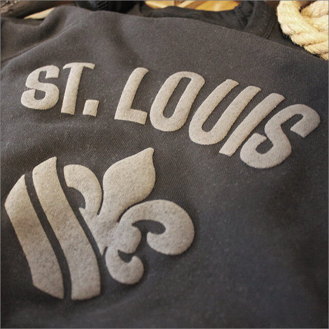
With that said, what I wanted to do was create a fleur de lis specifically FOR St Louis. That’s the idea that the “STL Fleur De Lis” was founded on. The design elements in the St Louis flag all compressed into one solid and very versatile image. The two wavy lines at the bottom represent St Louis’ twin rivers: the Missouri River and the Mississippi River. So now, I can design around it without the constant use of the title “St Louis” or it’s airport code (STL) — which tends to be a little uninspired and drab. The StL Fleur De Lis is a fresh and new take on the French symbol and it’s relation to St Louis. It’s something to be proud of created and spearheaded by a native St Louis designer who’s fully invested in the likes of this beautiful city.
Top left to bottom right: Creve Coeur symbol, the coat of arm of Florence, The Saints (American football team), French Canadian fleur de lis, and The Royal Banner of France or the "Bourbon Flag".


